WATER


Water has always presented a special challenge for artists. It has no consistent shape or color. It does not reflect light or cast shadows the way solid objects do. In the picture above of a shipwreck and the following picture of a placid river, illustrator N.C. Wyeth captures two very different examples of water's temperament.


Water refuses to hold still like a bowl of fruit on a table in your art studio, so painters have gone to extraordinary lengths to observe it. J.M.W. Turner famously lashed himself to the mast of a ship in a storm at sea so he could experience the power of water. Renowned illustrator and maritime painter Stanley Meltzoff is a long time diver. Meltzoff's immersion in his subject pays off in vivid, exciting paintings. Note the marvelous abstract design in the interplay of light and water at the top of the picture:


Illustrators over the years have employed a fascinating variety of approaches to water. For some artists, water seems to serve as rorschach test. They have to reach deep into their own personal taste and style to create form and shape and content for water. In the following picture illustrator Robert Fawcett (who was a first rate draftsman but unfortunately color blind and a second rate painter) tries to capture water by painting it as if it were a line drawing:


When Maxfield Parrish wanted to paint water, he often used a mirror for reference, rather than studying real water. The result was a picture of water as artificial as Parrish's candied, fantasy style:


Of course, Frank Frazetta painted water using his own trademarked formula:


Strikingly different methods of depicting water have also been adopted by animators (ranging from Pinocchio and Fantasia to the Incredibles) and by Japanese woodblock artists such as Hokusai. I would be interested in input from readers on additional artists and approaches.

In my view, the most impressive maritime paintings today are being produced by Meltzoff:


I recently read Meltzoff's views on the creation of art underwater. He wrote
Underwater it is somewhat as if Tiepolo were doing free floating and flying mythologies in the water instead of in the air and illuminated them with focused sheets and bands of strobe lights. That is what makes it so interesting for me to dive.
I will devote my next posting to some of Meltzoff's insights.

ONE LOVELY DRAWING, part seven


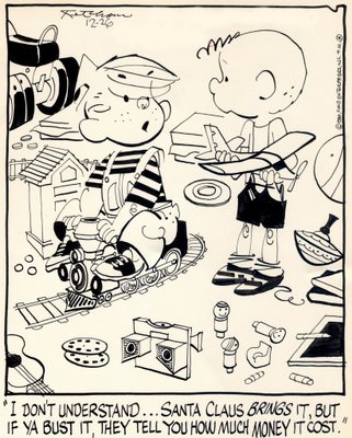
This drawing by Hank Ketcham dates back to the era before comic strips were drawn with the monotonous line of a felt tip marker and reproduced at the size of a postage stamp. Looking at this original drawing, you can feel the bite of Ketcham's pen nib on paper. You can see how Ketcham expertly guided the flow of the ink around the page like a master hydrologist. The energy and variety of Ketcham's line create a joyful little design at the same time that it conveys a wealth of information about his subject.


By the time this drawing appeared, Ketcham had been drawing Dennis the Menace for over 35 years. His creation had become a big business, and the weary Ketcham often resorted to ghost artists to draw his panels. Yet, when Ketcham picked up the pen here, he still took obvious pleasure in drawing the folds in the pants or the squiggle of the child's elbow. This drawing may have taken Ketcham only minutes to execute, but it took decades to be able to draw it.

NO STRAIGHT THING


The illustrator Robert Fawcett used to complain about the grueling training in figure drawing that he received at the Slade school in London. He recalled bitterly how one professor made him devote a full week to drawing a single figure on plain paper using a hard graphite pencil. While it seemed like torture at the time, Fawcett admitted that by forcing him to focus on every nuance of the drawing, his professor weaned him from "the long, long search for shortcuts."

This training shows up in many of Fawcett's illustrations, where he rarely resorted to the popular shortcuts in rendering the human figure. He did not assume that figures stood at a right angle to the ground, or that they were symmetrical.


You rarely see straight lines for pants legs or ovals for heads. If you look at the shoulders, posture and body frames in these examples, you will see the work of an artist who kept his eyes open.


The great philosopher Immanuel Kant once observed, "Out of the crooked timber of humanity, no straight thing was ever built." Fawcett seemed to appreciate that, and took great delight in illustrating the knot holes, wood grain and corrugated bark of his subjects.

ONE LOVELY DRAWING, part six


The Spiderman movies made $1.6 billion even before the toy distribution licenses. But if you strip away the investment bankers, lawyers, production companies and talent scouts, the whole mighty empire began with one lone guy sitting at his drawing board late at night drawing pictures while moths flickered around his fluorescent light.

That guy was Steve Ditko. When you look at his original drawings, such as the one above, you can appreciate how rich and evocative they were. Even when muted by cheap printing on pulp paper, even without computer graphics, explosions in dolby sound and flashing lights on a big screen, they were able to capture the imagination and loyalty of young boys. Ditko's battered drawing board is where it all started, the chain of events that went on to make hundreds of people fabulously wealthy (but not, of course, Steve Ditko).

Ditko reminds me of the ancient Egyptian temple of Karnak.


The Egyptians built that massive temple over a 2,000 year period. The temple grounds cover 200 acres of buildings, sacred lakes and grand courtyards. Karnak's Sacred Enclosure of Amon alone is 61 acres and would hold ten European cathedrals.

But at the very heart of this sprawling temple compound is the Naos, the small primeval mound where ancient people first gathered to worship long before the engineers, builders and armies showed up. A handful of people found religious inspiration from that site, never dreaming that a mighty empire would arise from where they stood. If you are impressed by the wealth and power of Karnak's concentric circles of vast courtyards and massive columns, it is good to remember that they all grew from a small sacred spot at the inner most core of the temple-- the "Holy of Holies."

The place where the original artist's brush touched the paper, that is the holy of holies.

Total Pageviews

Followers