LORADO TAFT'S FOUNTAIN OF TIME


Artists always dream of creating works of permanence. Perhaps they hope that "timeless" art will help them live on past their death.

Lorado Taft (1860-1936) was that kind of artist. A Chicago sculptor of monumental, heroic subjects, Taft worked from 1907 to 1922 on his life's masterpiece, a huge sculpture about mortality called The Fountain of Time. The sculpture was based on a line from Austin Dobson:
Time goes, you say? Alas, time stays; we go!
Taft created a 120 foot long parade of humanity with over 100 different figures symbolizing life's journey from birth to death.


This "march of the doomed" takes place in front of an imposing, 26 foot tall statue of Father Time.


Taft wanted his sculpture to have an eternal look, so he designed it in a classical "beaux-art" style. Unfortunately, by the time he finished, the beaux-art style was already unfashionable. It was replaced by abstract modernism. (Perhaps Time felt that Taft's ambition was impertinent and wanted to teach him a lesson.) In any event, the leading Chicago newspaper soon labeled the outdated sculpture one of the city's "pet atrocities." Resentful at the way styles had passed him by, Taft became a leading spokesperson for conservative sculpture and lectured against the evils of modernism (demonstrating that he had learned absolutely nothing about the inevitability of time).


Taft also tried to construct his sculpture using materials that would last a long time. After consulting with engineers, he decided on steel reinforced, hollow-cast concrete. Unfortunately, this choice was not well suited for Chicago winters. The concrete expanded and contracted, causing cracks in the surface. Details eroded and crumbled away forever. By the 1980s, the interior was crumbling due to moisture buildup, and the surface had become pitted and drab, assaulted by time, elements and pollution.


Even then, time was not done transforming Taft's work. Taft had envisioned his sculpture as the centerpiece of an elegant park in the style of the World's Columbian Exposition, where Taft first worked as a sculptor. However, the neighborhood changed with time. The surrounding city deteriorated even more than the sculpture. The sculpture became overgrown with weeds. There were no funds for sculpture repairs in a rough neighborhood on the south side of Chicago.


As a small boy in Chicago, I used to stand in that park and stare up at Taft's crumbling sculpture. Its subject was scary for a kid, but not nearly as scary as the changes wreaked by the passage of time.

I revisited that sculpture years later when I returned to Chicago as a law student. By then, time had transformed both me and the sculpture. I had grown to understand that, no matter how big or permanent we try to make art, it will not enable us to outwit time. No matter how grand or eternal the subject matter that we choose. No matter how wise the artist. No matter how much the artist got paid.

Taft had to learn the hard way that even art can't rescue us from the gaping maw of time; we just have to keep looking for our solace.

This happy happy love
Is sieged with crying sorrows,

Crushed beneath and above

Between todays and morrows;

A little paradise

Held in the world's vice.


....

This love a moment known

For what I do not know

And in a moment gone

Is like the happy doe

That keeps its perfect laws

Between the tiger's paws

And vindicates its cause.


. --Edwin Muir


COBY WHITMORE


The great Coby Whitmore reminds us that a picture can be bigger when it doesn't fill up the whole page.

FRED

.

Andrew Wyeth called this painting "Marsh Hawk."


Having trouble finding the marsh hawk? Why, here it is way over at the edge, sitting on a post:


Harold von Schmidt painted this wonderful painting of revolutionary war hero William Dawes. Can't see him? If you are lucky, you might catch a fleeting glimpse of his butt.


This is Brueghel's painting of the fall of Icarus, the boy who flew too close to the sun. But Icarus is not exactly hogging the spotlight.


Here are his legs, way down here:


The literary critic Marvin Mudrick once said,
If you're ever tempted to write a story called "The Secret of the Universe" or "Man's Inhumanity to Man," do yourself a favor and call it "Fred" instead.
For today's post, I was tempted to expound at length on the importance of avoiding obviousness in art.

But I think I won't.

BALANCING INSPIRATION AND PERSPIRATION

Illustrator Chris Van Allsburg once said that he spent only a small percentage of his working time making creative choices. The vast majority of his time was spent on the manual labor of implementing those choices. He would spend days and days painstakingly drawing individual blades of grass and leaves.


Artist Bernie Wrightson seemed to work the same way. He spent a great deal of time mechanically implementing his initial artistic decisions:


(In my view, this often resulted in a mountain of effort for a molehill of a result.)

Illustrator Robert Vickrey had a similar laborious style. Once he designed a picture, he would spend weeks filling in backgrounds such as concrete surfaces and brick walls.


I was thinking about this trade off as I was marveling at the paintings of Dreamworks artist
Nathan Fowkes. Fowkes works at the opposite end of the spectrum.


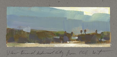
Note the simplicity and economy with which he created that notch in the nearest line of mountains, or the way he conveyed important gradations of color within a single brush stroke.


These are small paintings (most are less than 3x5") that were painted very quickly (usually in 20 to 40 minutes) yet each one contains the entire genetic code for a larger, finished painting.


These sketches demonstrate all of the hard artistic decisions (commitments to a composition and a design, selections of color and technique) by which a finished work of art might be judged. They are pure artistic choice in its most concentrated form, without all the numbing labor and secondary refinements found in the finished pieces above.

Don't make the mistake of thinking there is anything crude about these paintings just because they are sketches. The subtlety of color in this next little beauty is absolutely breathtaking:


While they are smaller in size and took a fraction of the time, Fowkes's sketches convey far more information, with far more insight, than the larger finished works of Van Allsburg, Wrightson and Vickrey above. Each stroke or color choice by Fowkes has real significance.

I particularly enjoy the rich variety that Fowkes finds in the view from his window. These tiny pictures are so dense with knowledge, they must have the atomic weight of weapons grade plutonium:


I find his curiosity about this view quite contagious.

Van Allsburg, Wrightson and Vickrey are all talented fellows and I admire their work, but there is a separate beauty to Fowkes's economy, and I commend his work to you.

Total Pageviews

Followers